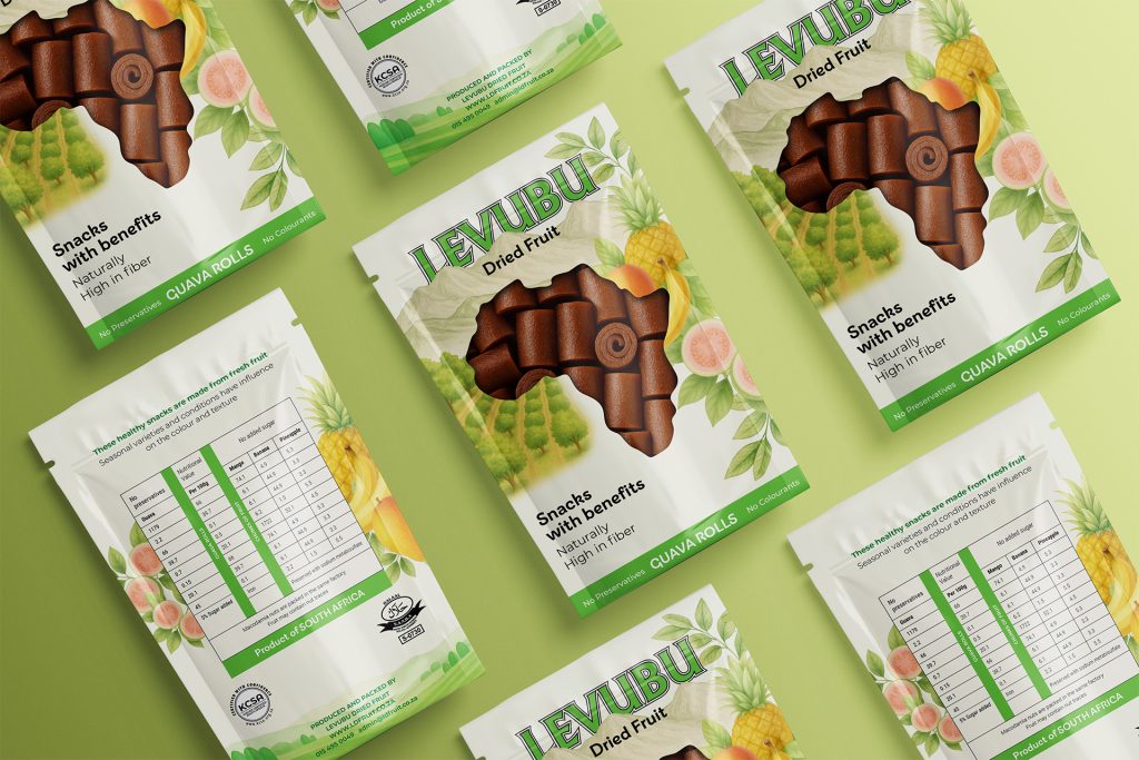
Visually striking yet professional designs, crafted to reflect Roamlock’s brand identity and deliver a consistent, premium look across brochures and packaging.
Project Description
Roamlock required a cohesive range of printed brochures and packaging that captured the brand’s premium, professional image while standing out visually. The project focused on creating modern, balanced layouts that highlight product details with clarity and impact. Every element — from typography and color to composition — was designed in alignment with Roamlock’s brand guidelines, resulting in a collection that feels both distinctive and consistent across all print materials.
This project contained a complete onboarding process following meetings, presentations and moodboards to ensure we were all aligned on the expectations.
Moodboards are presentation/presentations put together containing fonts, colours, textures, images and a complete voice guidance for the brand personality. This will have an impact on the logo direction and where to start and where to focus.
A total of three concepts were worked on with precise detail and intention to ensure the client had a good idea of which way they would like to proceed for their brand voice.
The client received a full brand identity containing rules of the logo, fonts, colours and images they were to use – Including image colour treatment and the exact tone of voice for each design element to ensure all branches and team members follow the same guide rules.
All items were packaged into folders, and the client received a large PDF file containing the rules, colour codes for web and print, as well as all of the relevant guidance for anyone to adapt to their tone of voice.
This includes the logo exported in various formats for easy distribution.