Brand IdentityLogo DesignPrint DesignWebsite Design

Sheq Logo & Branding

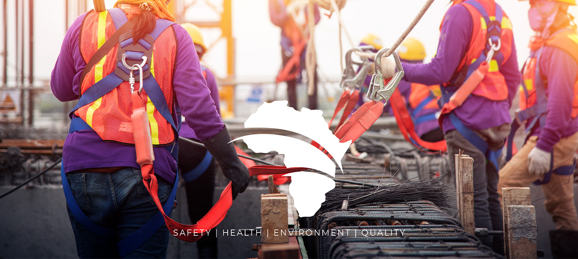
Sheq’s new look is vibrant, modern, and confident; a bold reflection of its dynamic commitment to safety and leadership.

Project Description

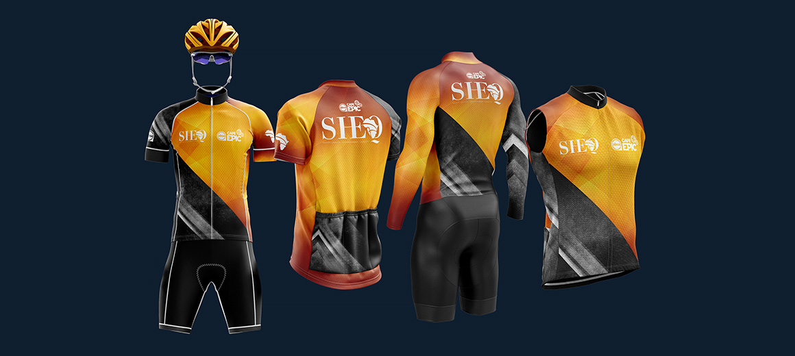
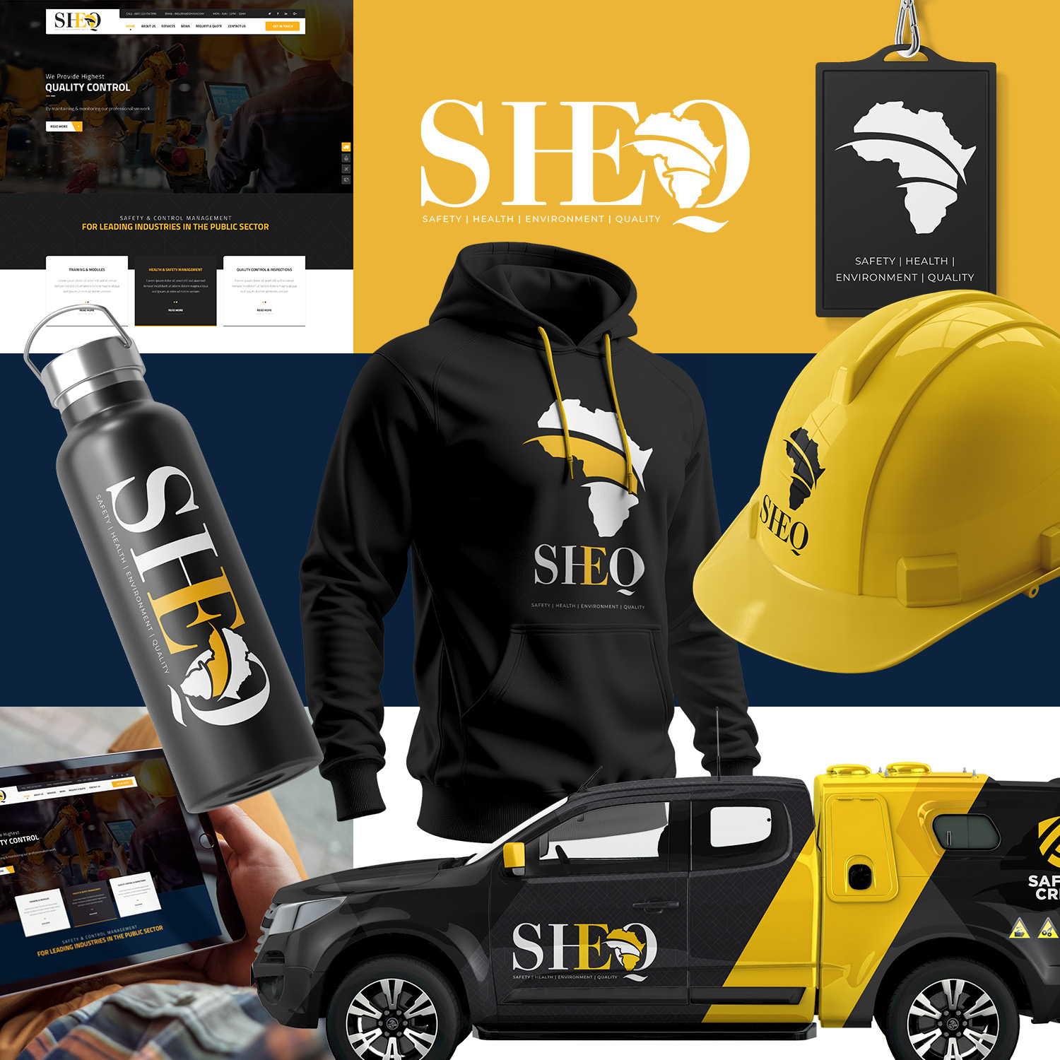
For SHEQ, I developed a bold and impactful brand identity that reflects their commitment to safety across construction and industrial environments. The logo and visual system were built around high-visibility colours, bright safety yellow, deep blue tones, and strong black accents, creating an instantly recognisable and authoritative presence. From print materials to branded gear and signage, every element was designed for clarity, durability, and maximum visibility, ensuring the brand communicates trust, safety, and professional compliance at every touchpoint.

Duration

From first concepts to final branding output, the project took about 8 weeks to complete the first stage of design. Vehicle signage and other branding elements took another 3 weeks.

COMPLETE
Find Out What to Expect

What this project contained.

Onboarding

This project contained a complete onboarding process following meetings, presentations and moodboards to ensure we were all aligned on the expectations.

What are moodboards

Moodboards are presentation/presentations put together containing fonts, colours, textures, images and a complete voice guidance for the brand personality. This will have an impact on the logo direction and where to start and where to focus.

Logo design

A total of three concepts were worked on with precise detail and intention to ensure the client had a good idea of which way they would like to proceed for their brand voice.

Brand Identity

The client received a full brand identity containing rules of the logo, fonts, colours and images they were to use – Including image colour treatment and the exact tone of voice for each design element to ensure all branches and team members follow the same guide rules.

Packaged

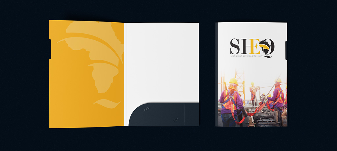
All items were packaged into folders, and the client received a large PDF file containing the rules, colour codes for web and print, as well as all of the relevant guidance for anyone to adapt to their tone of voice.


This includes the logo exported in various formats for easy distribution.

Testimonials

Featured Endorsements & Contributor Spotlights
5/5

“Softy Solutions took our rough concept and turned it into a polished SaaS product in just 8 weeks. The speed and quality blew us away!”

— Alex Carter, Founder of Taskify
4/5

“Their AI-powered workflow is a game-changer. We launched ahead of schedule and under budget.”

— Lena Torres, CEO of BrightFinance
5/5

“Softy Solutions turned our scattered idea into a polished MVP in under two months. The AI-driven workflow saved us months of trial and error.”

— Sofia Patel, Co-Founder at EcoLink
5/5

“They didn’t just build our product — they challenged our thinking and made it better. Their AI prototypes nailed 90% of our vision on the first try.”

— Daniel Wright, CEO of FlowPilot

Related Projects

Packaging DesignPrint Design

Levubu

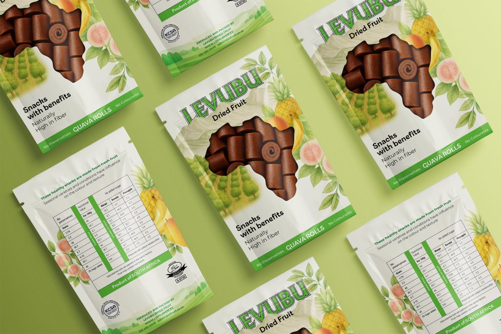
A refined packaging design for Levubu, combining classic illustration with soft, natural hues to create a premium, timeless feel. The pouch features a front cut-out window that reveals the dried fruit inside, adding authenticity while enhancing shelf appeal and consumer trust.
Brand IdentityWebsite Design

Magazine layouts

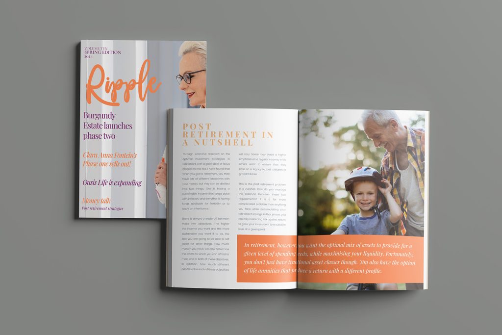
Designed with elegant peach and soft purple tones, these magazine layouts capture the effortless warmth of summer. Clean typography, airy spacing, and a fresh visual flow bring the season’s calm, sun-kissed energy to life while keeping the content stylish, inviting, and beautifully cohesive.

Brand IdentityWebsite Design

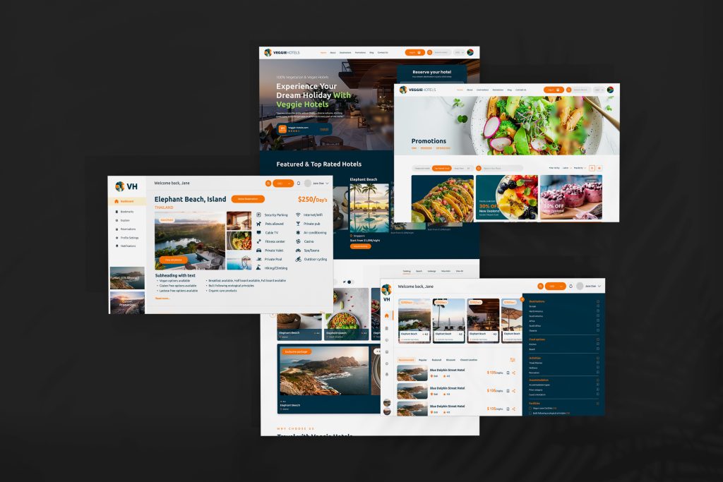
VHotels app & website

VH mobile and website screens designed to showcase a clean, modern interface with intuitive navigation and a refreshed brand look.

Digital CampaignPowerPoint

Immortalise Preso Brochure

The Immortalise brochure features clean, expressive and impactful layouts to emphasize Dunkirk.

PowerPoint

Immortalise PowerPoint

The Immortalise presentation template features clean, expressive layouts designed to highlight powerful storytelling.

Prev Wicked London Coffee Logo
FGrill Print Campaign Next

Freelancersa.com - Nicolene Scheepers / All Rights Reserved ©