AI-powered shopper insights and predictive inventory management for global retail chains.
Project Description
The Nano Nutrients product catalogue and brochures were crafted with meticulous precision, ensuring every visual and structural element aligns seamlessly with the brand’s identity. The colour palette was carefully matched to the product packaging, creating a cohesive flow from shelf to page, while the typography adheres to the brand guide with absolute accuracy—consistent weights, perfect hierarchy, and crisp readability. Alongside strict brand fidelity, I added a refined design flair of my own: modern spacing, elevated layout compositions, and subtle visual accents that enhance clarity without overshadowing the scientific integrity of the brand. The result is a catalogue that not only informs, but elevates the Nano Nutrients experience—professional, cohesive, and unmistakably premium.
Start Date / End Date
Entire project for both brochures and ditigal campaigns following these assets took 2 – 3 months.
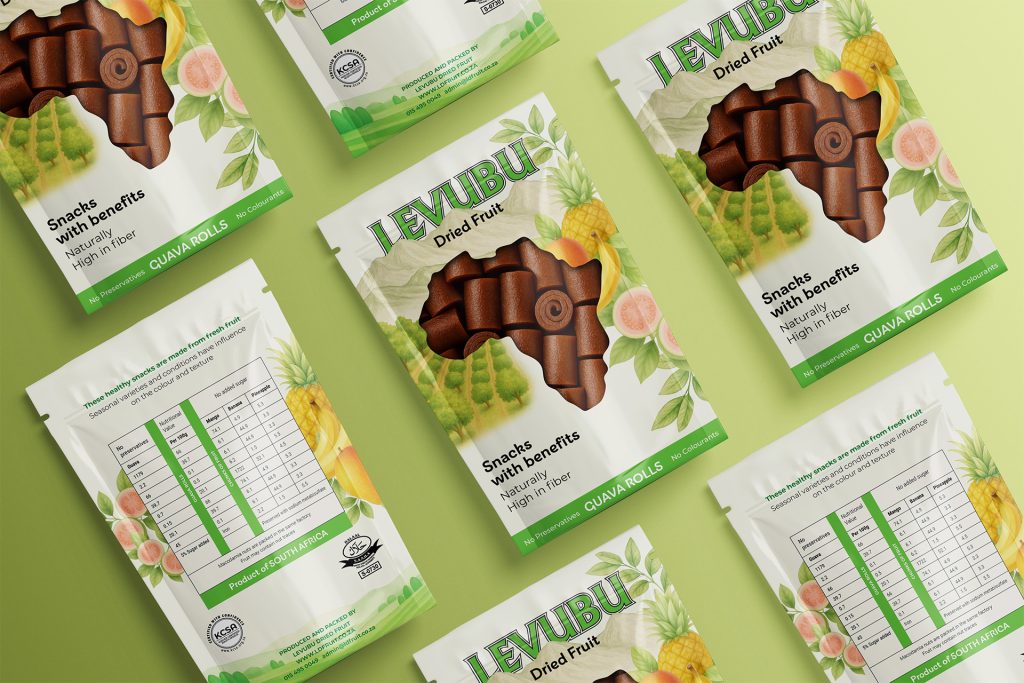
A refined packaging design for Levubu, combining classic illustration with soft, natural hues to create a premium, timeless feel. The pouch features a front cut-out window that reveals the dried fruit inside, adding authenticity while enhancing shelf appeal and consumer trust.
Designed with elegant peach and soft purple tones, these magazine layouts capture the effortless warmth of summer. Clean typography, airy spacing, and a fresh visual flow bring the season’s calm, sun-kissed energy to life while keeping the content stylish, inviting, and beautifully cohesive.