Magazine layouts

Designed with elegant peach and soft purple tones, these magazine layouts capture the effortless warmth of summer. Clean typography, airy spacing, and a fresh visual flow bring the season’s calm, sun-kissed energy to life while keeping the content stylish, inviting, and beautifully cohesive.

Project Description

For the Ripple Summer magazine, I crafted layouts that feel as soft and refreshing as the season itself. Using an elegant blend of peach and purple tones, the design captures the warm glow of late sunsets meeting the cool hush of ocean horizons. Each spread was intentionally composed with gentle gradients, airy spacing, and flowing visual movement, creating a reading experience that feels calm, modern, and beautifully curated. Photography, typography, and colour harmonise to evoke sunlit afternoons, breezy coastal moments, and that unmistakable slow-summer magic. The result is a magazine that doesn’t just showcase content — it wraps the reader in a serene, polished, and irresistibly summery visual atmosphere.

Duration

The project took about 1-2 weeks from conceptualization to completed project.

Related Projects

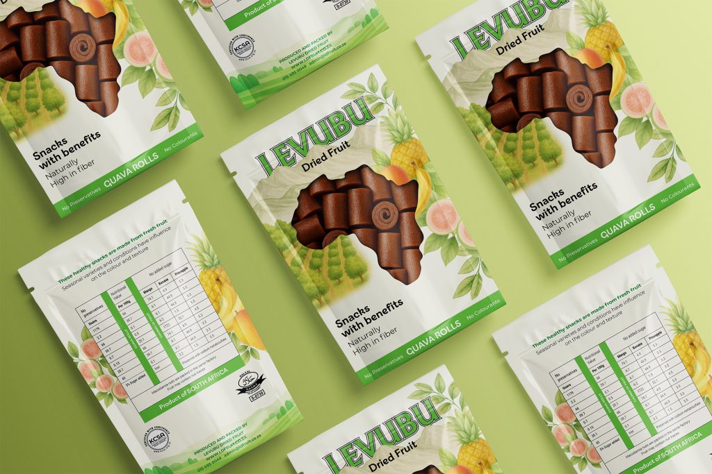
Levubu

A refined packaging design for Levubu, combining classic illustration with soft, natural hues to create a premium, timeless feel. The pouch features a front cut-out window that reveals the dried fruit inside, adding authenticity while enhancing shelf appeal and consumer trust.